Emma Chamberlain and I Have the Same Taste in Interior Decorating
Graphic by Molly Van Gorp.
I remember when Emma Chamberlain dropped out of high school. I remember when she left her home for L.A. and moved into her first apartment. I remember her first appearance at the Met Gala. Now, as she moves into her 4.3 million-dollar home, I know I’m going to remember that, too.
It’s bizarre to consider how Emma has made it to where she is in her career, especially since a lot of us used to be her in a way: disillusioned middle-schoolers with way too much misplaced confidence and a ring light. Afterall, a big part of her appeal is her ability to relate to viewers even as she levels up in the world of celebrity.
Now, she’s still reaching milestones like the rest of us, just completely blown out of scale. While Emma decides which extra bedroom to use as her closet, we’re signing leases on stuffy apartments or cramming everything we own into a single school-appointed dresser.
This story will attest to Emma Chamberlain’s relatability by proving that we’re actually pretty similar when it comes to interior design. That is, if similar means making the most out of our drastically different budgets and deciding how to liven up our completely different spaces.
LIGHTING
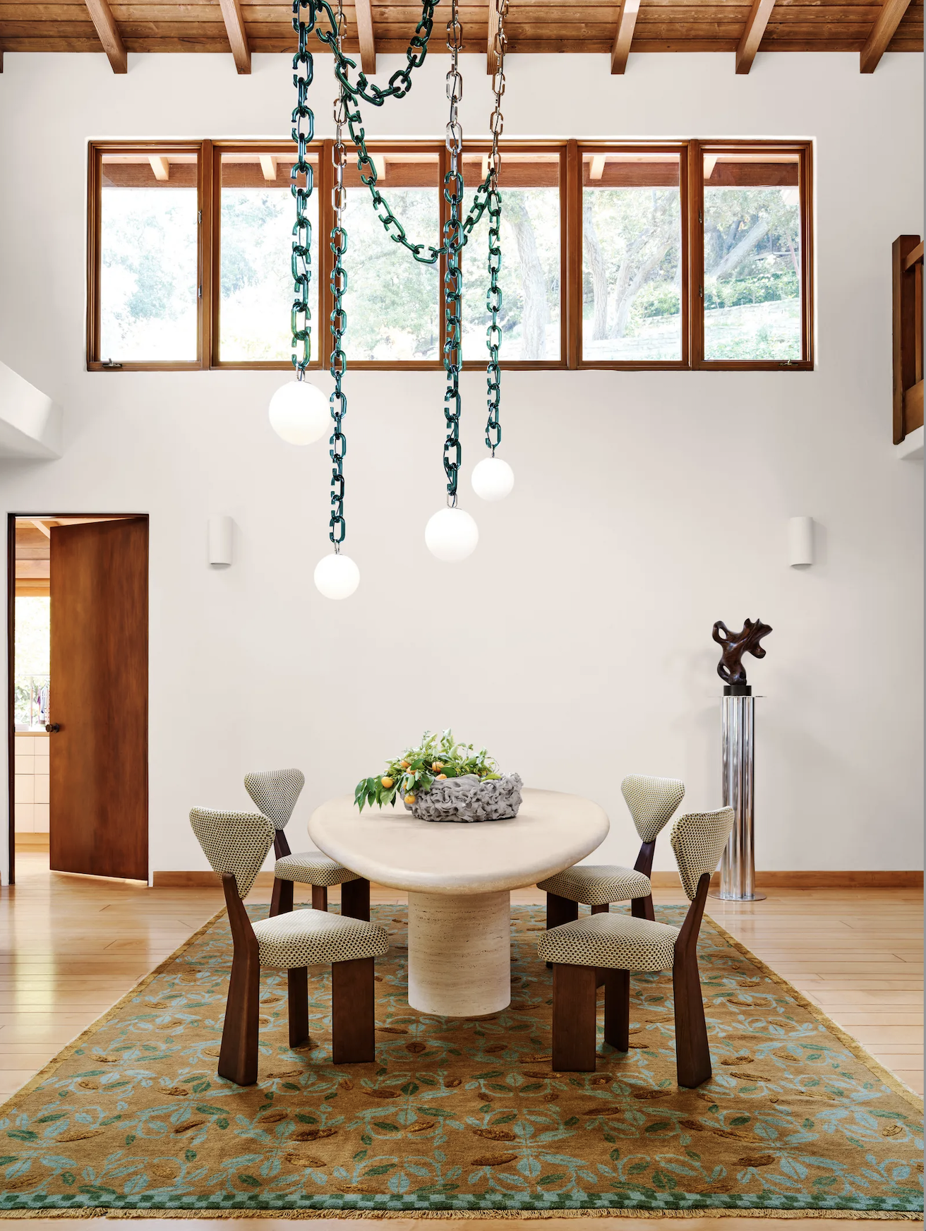
Sitting above Emma’s dining room table is a beautiful Trueing chain-link chandelier. With spherical lights fastened to draped blue chains, the design stands out against the white walls. In an Architectural Digest video about her home, Emma said that the piece spoke to her because most chandeliers aren’t very cool, and “it’s kind of like an art piece within itself.”
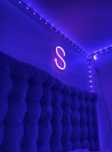
While Emma may have spent $31,800 to light up her home, Weinberg second-year Sammie Hesekiel says that she has opted for a more budget-friendly source of lighting: her LED lights. Both effective ways to brighten a space, LED lights actually have a lot in common with the expensive chandelier: a statement piece, eye-catching with color mood setting. But only one of the two comes with different settings and colors, and it’s not the one that costs half of most college tuition. Images below (from left to right): Architectural Digest and Sammie Hesekiel.
STEP LADDER
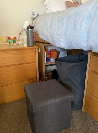
To reach those high up places in her dressing room, Emma spent $540 on a Kartell orange acrylic step stool. She said she wanted to “take something boring like a step ladder and try to find one that [she] actually liked that could actually add to the space.” Emma chooses to display her step ladder because of its playfulness. On the other hand, Weinberg second-year Violet Hamlin displays her step stool, a gray collapsible storage ottoman, because she needs it to get onto her lofted bed.
It can be fun to find a statement piece, but most college students are looking for practicality. Hamlin reaches her bed using the ottoman and can store extra clothes if she needs. When guests come, it also becomes an extra seat. Why spend so much on a step ladder that isn’t even multi-functional? Images below (from left to right): Architectural Digest YouTube and Violet Hamlin.
TABLE
And, in perhaps her most hysterical design choice yet, Emma’s poolside furniture from Third Drawer Down incorporates fruit and vegetable themed tables. After receiving her first corn cob table as a gift, she bought two more as well as a pineapple table to complete the space. She says she chooses stuff that makes her “smile and giggle and chuckle”, which certainly conveys a proper reaction to the tables.
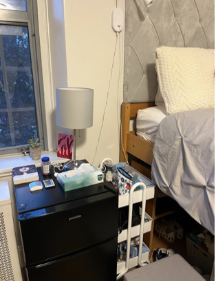
If Emma’s tables look like food, then Medill second-year Sari Dashefsky’s table looks like what the food goes in: her mini fridge. Well, it’s not like she bought a mini fridge themed table. It’s really just a mini fridge. Unable to fit a bedside table in her room, Dashefsky uses the surface of the fridge to hold her nighttime needs. Sometimes it’s more fun finding new ways to utilize what you already have than buying $245 worth of giant fruit and vegetables, although they are super cute. Images below (from left to right): Architectural Digest and Sari Dashefsky.


